Unimatrix
Zero
Brand
Identity
Unimatrix Zero is a record label that my partner and I launched together in summer 2022.
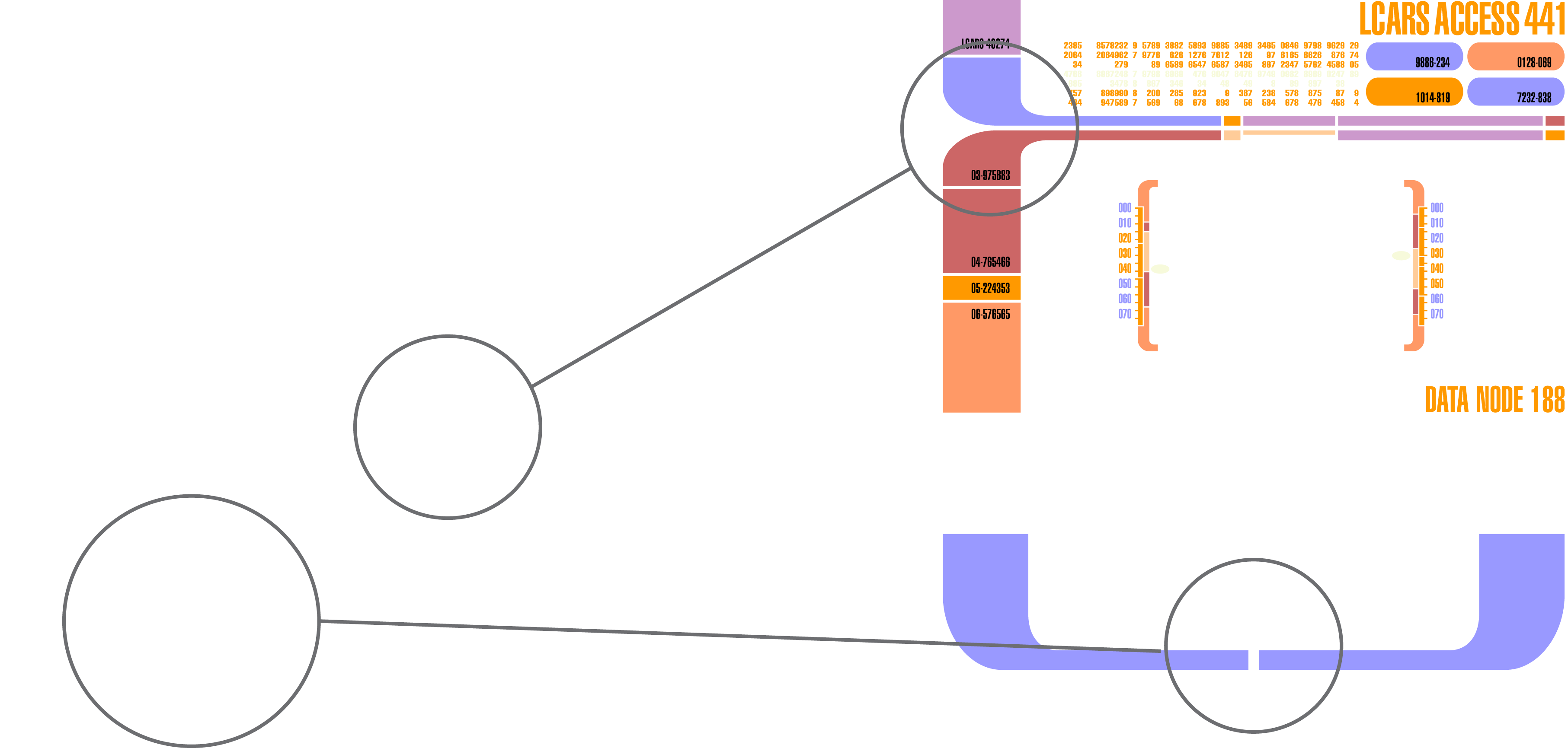
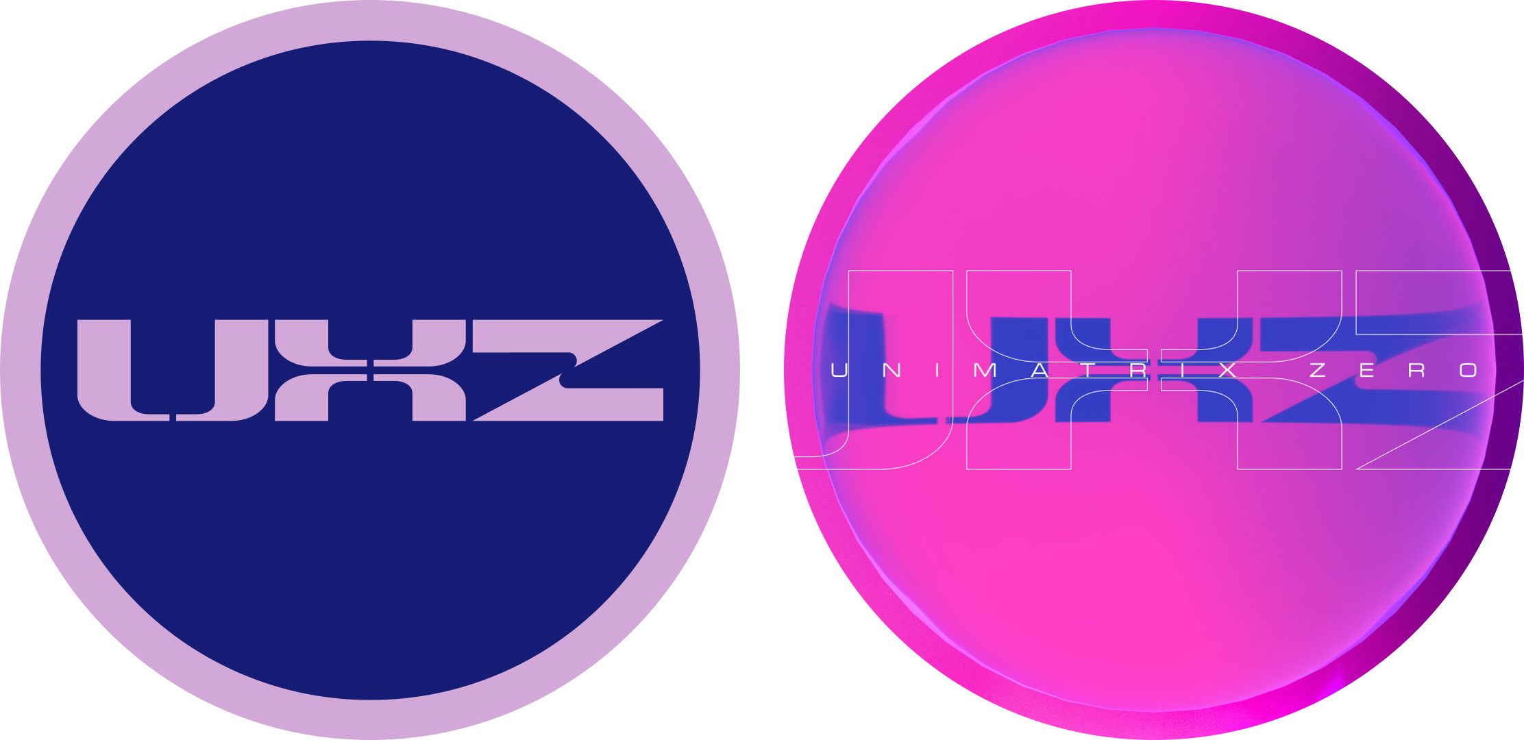
I tasked myself with designing the logo and overall brand identity, with the goal of creating something that was timeless, could work across multiple genres of music, and that left enough room for growth and evolution down the line. The primary logo mark is inspired by the LCARS user interface system found aboard all Federation ships within the Star Trek universe, and the word mark uses Microgramma, the same typeface used for starship designations on the hulls of all Federation ships.
Unlike the more templated approach favored by many dance music-focused labels, I wanted each album artwork to be self-contained and to tell its own story while still maintaining continuity.
The label’s name is derived from our shared love of the Star Trek universe, specifically Star Trek: Voyager’s season 6/7 episodes Unimatrix Zero Part I & II, telling the story of an alternate reality inhabited by Borg drones who find themselves on the path to self-awareness, free from the collective Borg consciousness. My partner and I couldn’t help but see the parallels between the Borg’s Unimatrix Zero and our cherished dance music community, both offering respite and a utopian ideal to the otherwise bleak and disheartening circumstances of our everyday lives.
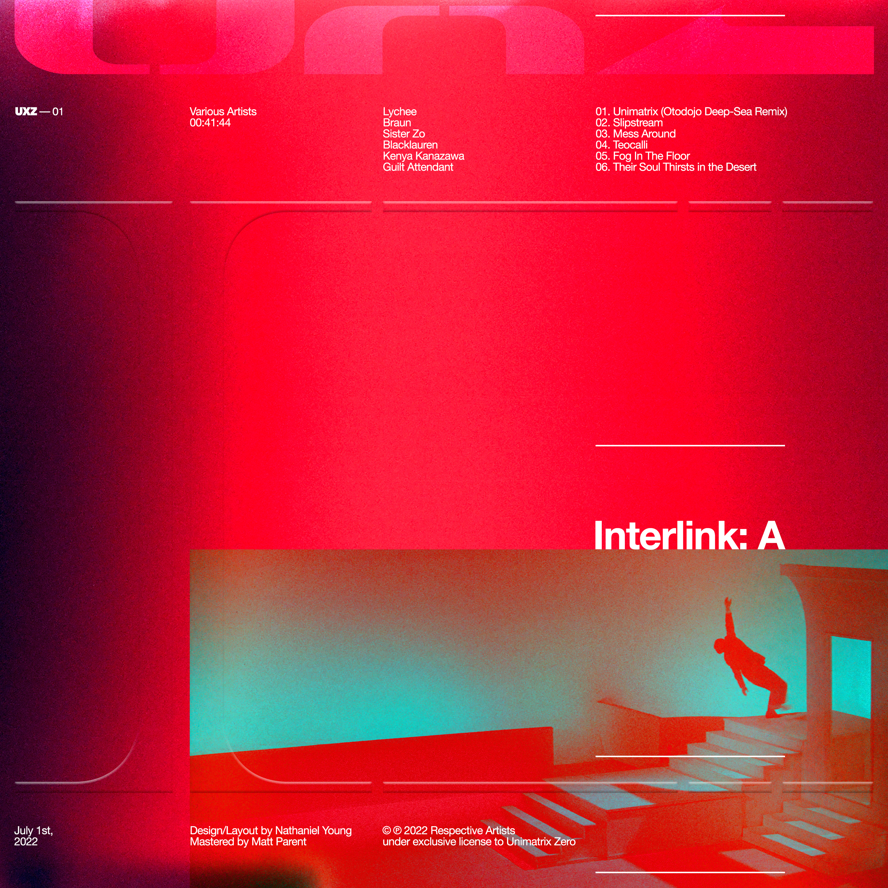
With these parallels in mind, we decided that the first release from our label would manifest as a various artist compilation comprised of music from friends and collaborators from across the North American dance music scene.
I tasked myself with designing the logo and overall brand identity, with the goal of creating something that was timeless, could work across multiple genres of music, and that left enough room for growth and evolution down the line. The primary logo mark is inspired by the LCARS user interface system found aboard all Federation ships within the Star Trek universe, and the word mark uses Microgramma, the same typeface used for starship designations on the hulls of all Federation ships.
Unlike the more templated approach favored by many dance music-focused labels, I wanted each album artwork to be self-contained and to tell its own story while still maintaining continuity.
The label’s name is derived from our shared love of the Star Trek universe, specifically Star Trek: Voyager’s season 6/7 episodes Unimatrix Zero Part I & II, telling the story of an alternate reality inhabited by Borg drones who find themselves on the path to self-awareness, free from the collective Borg consciousness. My partner and I couldn’t help but see the parallels between the Borg’s Unimatrix Zero and our cherished dance music community, both offering respite and a utopian ideal to the otherwise bleak and disheartening circumstances of our everyday lives.
With these parallels in mind, we decided that the first release from our label would manifest as a various artist compilation comprised of music from friends and collaborators from across the North American dance music scene.
Client: Unimatrix Zero
Type: Creative Direction, Logo Design, Album Artwork, Marketing
Year: 2022
︎︎︎ Link
Type: Creative Direction, Logo Design, Album Artwork, Marketing
Year: 2022
︎︎︎ Link
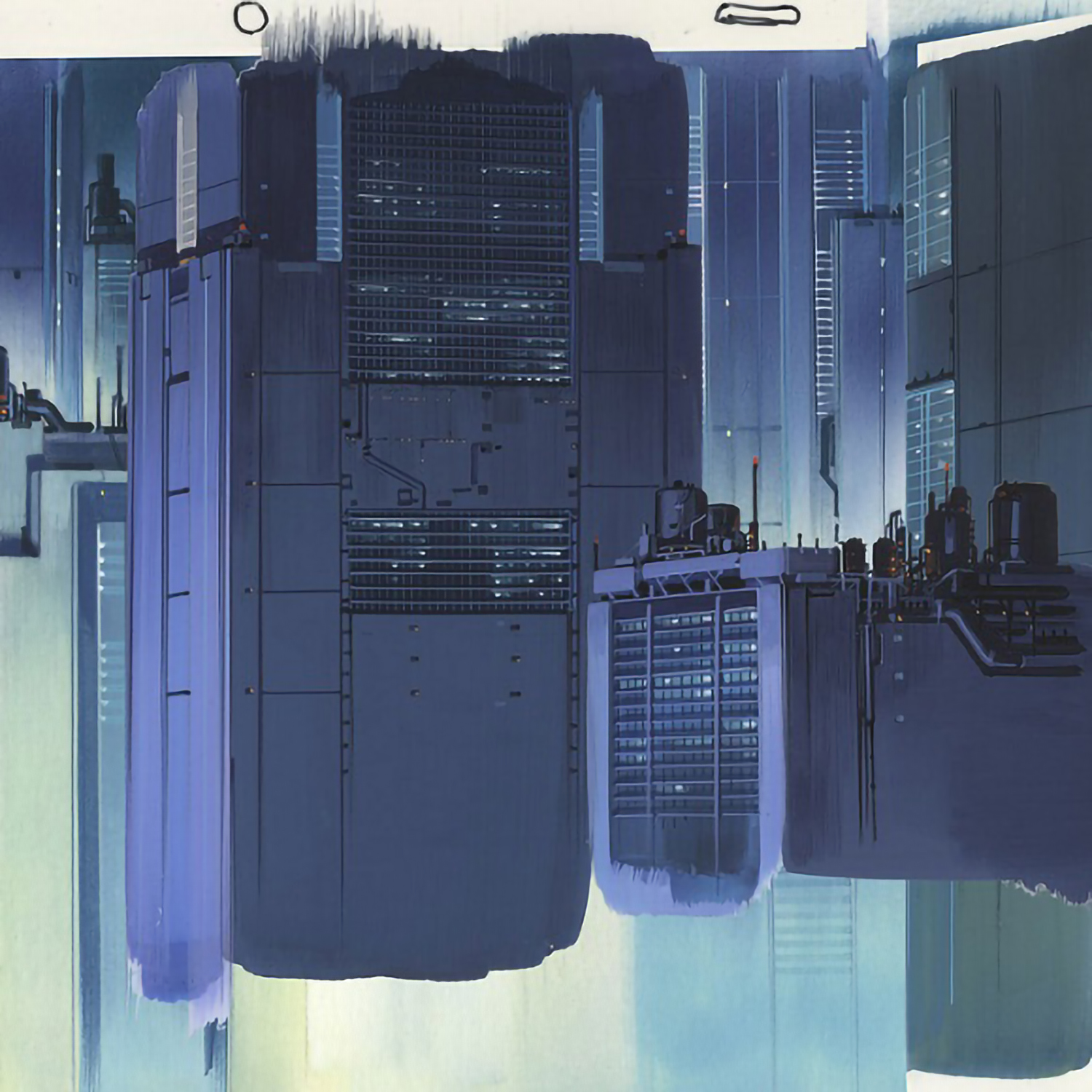
Mood Boarding /
Planning
Keywords & Concepts: Pastel dystopian utopia, whimsical menace, individuality vs collective consciousness, organic vs artificial, utopian necessity vs Borg efficiency, safety, seduction, community, sci-fi, cyberpunk, organic yet rigid, rave, cinematic, perceived futures
Cultural References: Star Trek: Voyager, Star Trek: DS9, The Matrix, Tokyo Drifter, Seijun Suzuki, Dorohedoro, Q Hayashida, Aposimz, Blame!, Tsutomu Nihei, Tetsuo: The Iron Man, Warp Records, Editions Mego, Raster-Noton
Cultural References: Star Trek: Voyager, Star Trek: DS9, The Matrix, Tokyo Drifter, Seijun Suzuki, Dorohedoro, Q Hayashida, Aposimz, Blame!, Tsutomu Nihei, Tetsuo: The Iron Man, Warp Records, Editions Mego, Raster-Noton


Logo Design /
Iteration 01
Sketches/
Initial Variants
Logo Design /
Iteration 02
Additional
Variants
Logo Design /
Iteration 03
Final
Logo

Branding /
Identity 01
While we felt it was important not to limit the brand’s visual language to any finalized palette of colors, in an effort to leave room for growth and evolution, we defined a few foundational starting points that would serve as a common thread throughout the brand’s identity in both digital and physical realms.
Color
Palette


Branding /
Identity 02
Social Media /
Web Assets


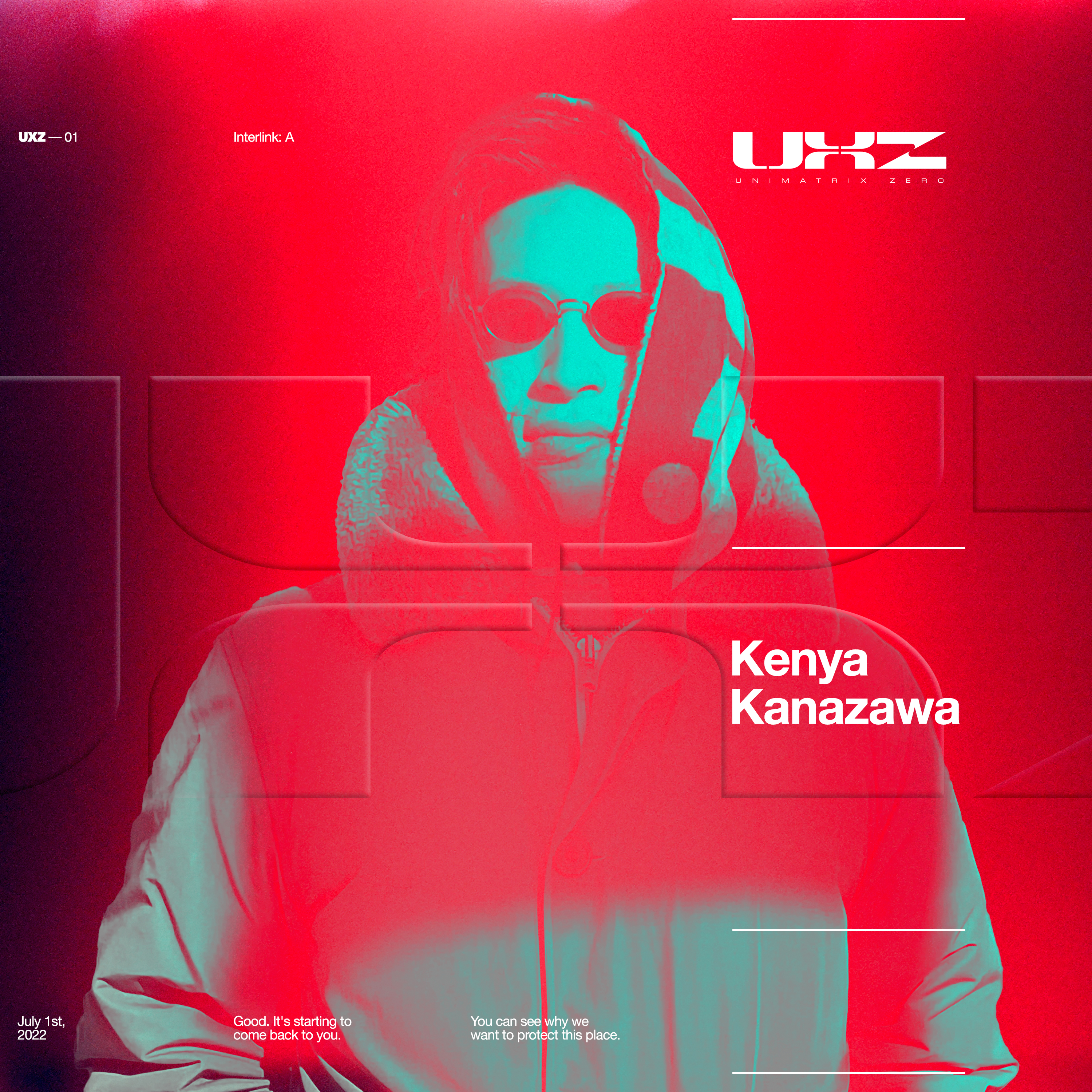
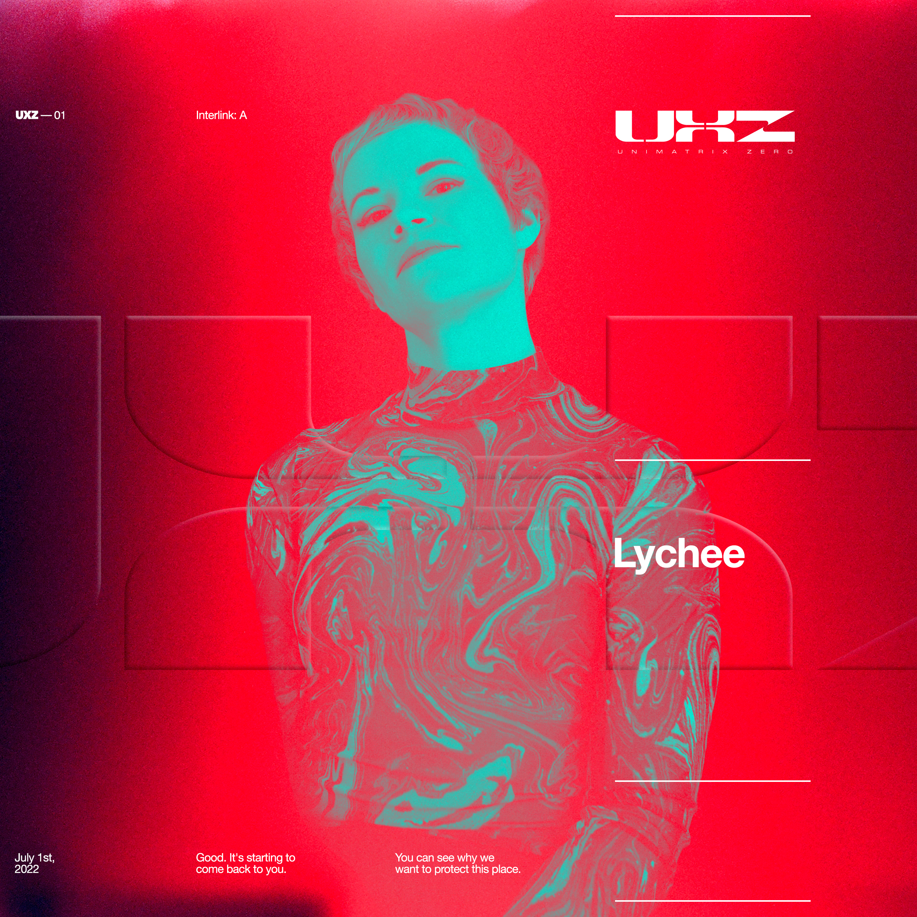
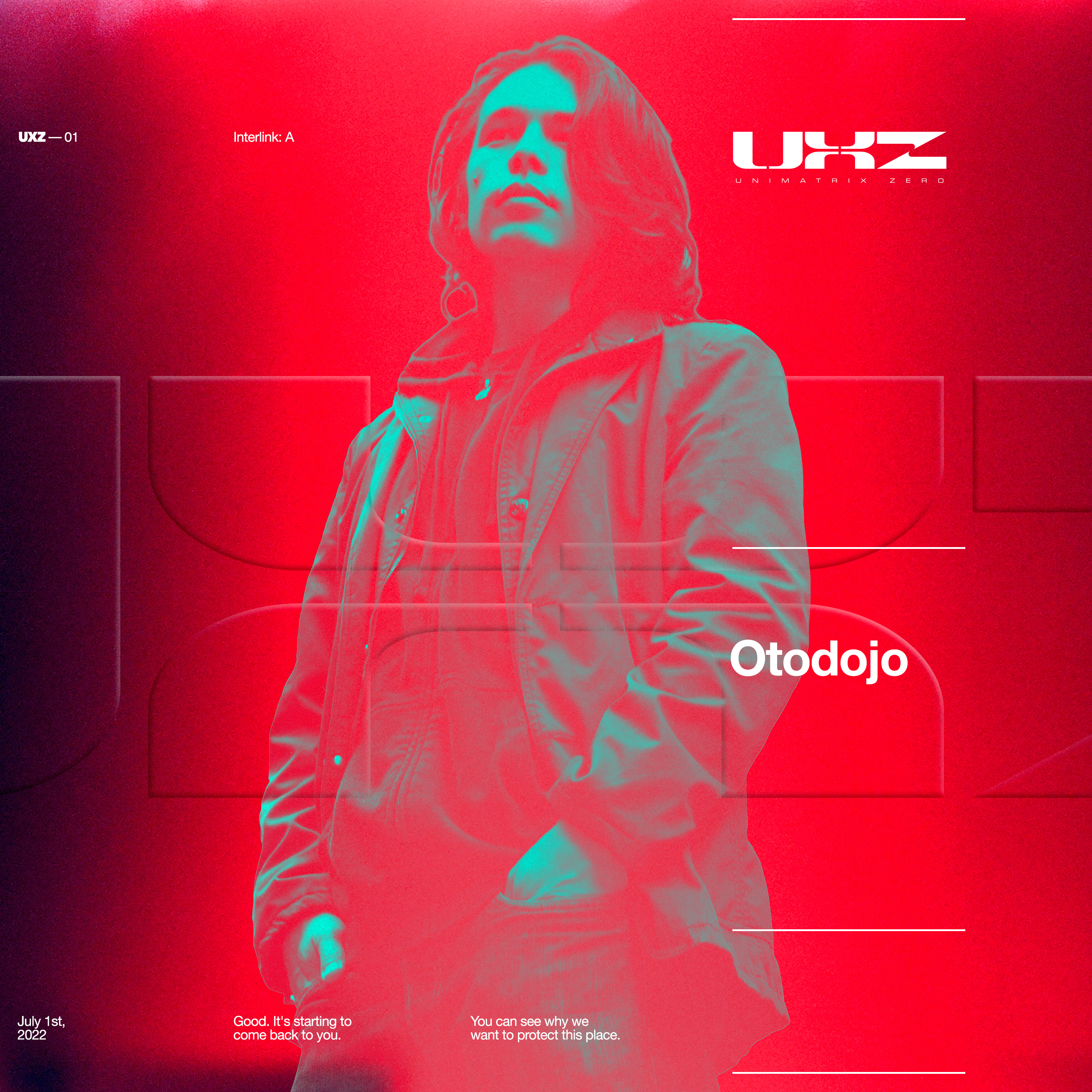
UXZ-01 Artwork /
Poster Design 01
Digital / Print
Assets
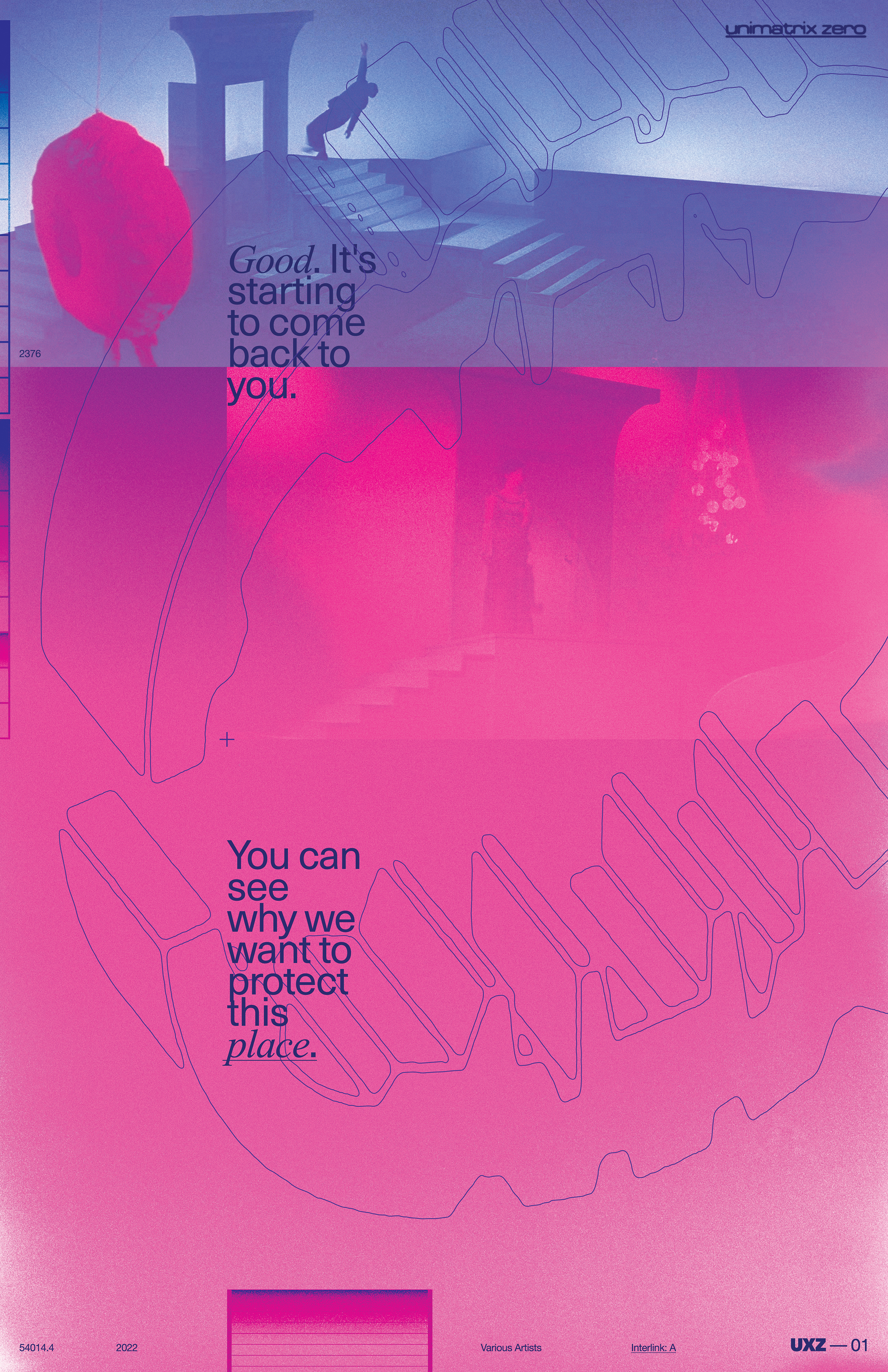
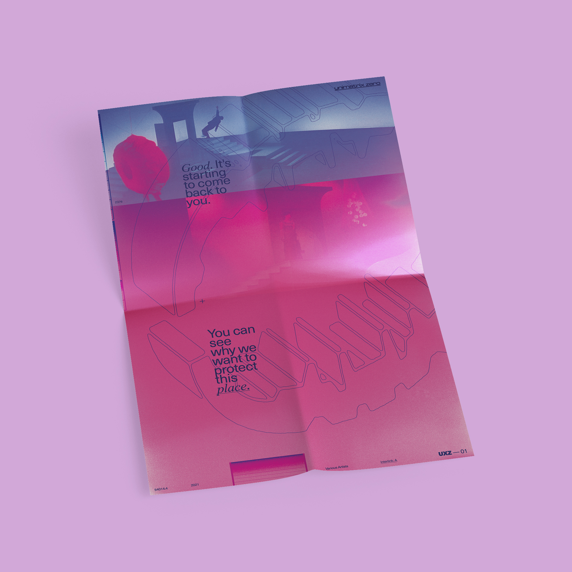
UXZ-01 Artwork /
Poster Design 02
Digital / Promotional
Assets